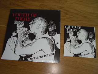
Revelation recently sneaked out another classic reissue. Nobody I know seemed to know that this one was on the way, so it was quite a surprise to get the weekly Rev email and find out that there were two more pieces of vinyl to pick up.
The record in question is a 12" reissue of the Youth Of Today debut record 'Can't Close My Eyes'. Originally released as a 7" by Positive Force back in 1923, this was repressed by Revelation as a 12" circa '97. And now again, in 2011.
This year's pressing comes on two colours of vinyl - red and purple. I got one of each:


As has been observed, there is a fair bit of variation between the shades of purple that this thing comes on. As you can see above, mine is very pale purple and looks almost grey. Others are very purple. Dobek has so far managed to obtain and document FOUR distinctly different shades so far. Peep his photo HERE.
This reminds me of two other records which have always featured on peoples' lists as either grey of purple:
1. Deadguy 'Fixation On A Co-worker' LP
2. Warzone 'Live At CBGB'
Both of these records are frequently described as either grey or purple. I think the reason is because this color is actually just all the random leftovers thrown in together. Some dude used to call it 'putty'. Others have referred to it as 'scrap'. Whatever. The point is, any record pressed on this colour is always going to have a ton of variations just because of how it's made. So stop trying to buy up every copy, Dobek!
What I like about this record is that Revelation have based the layouts on the original 7" pressing of this record. The previous YOT reissues that came out in the late 90s were remastered and came in new artwork... which was, for the most part, not very good compared to the originals. The 90s reissue of this record has by far the worst cover of any YOT record ever. Here's a pic to show the current reissue along with the original 7" and the awful 90s reissue.

And here's a few more pics to show the recent reissue next to the original 7". It's kinda cool how they've tried to make this new 12" version as close to the original 7" as possible. God only knows why they didn't do this back in 1997.


I guess I wouldn't be surprised if the other YOT records got the reissue treatment soon. I guess they must have been out of press for a few years now. If they do get repressed it'll be very interesting to see what happens to the artwork.

6 comments:
Yeah that reissue from 1997 is wretched. I was thinking that when I heard this was being released again.
I think all of the YOT re-issues look bad. I wonder how they would have looked if they got re-issued a couple of years earlier when my brother was the designer at Rev. I can't think why they even wanted to change the artwork, I think the originals are pretty iconic.
you've been dobeked...
I actually don’t think the front or back covers look good at all on this version. I’m not a fan of the ’97 versions either, but between the sub-par cover and that heinous grey vinyl, this is the ugliest release I’ve seen in a while. I thought Caroline did a better job touching up the original photo back when they reissued this as a 12” the first time. Anyone need one of the grey/putty variants? I’d be up to trade mine for one of the more purple looking ones.
rev is going down the proverbial shitter
Lins87 - I would dispute your comment. Specifically, the bit that says "is going". Replace that with "has gone" and I might be able to agree.
Lecky - can you point me towards anything specific that your brother designed whilst at Rev?
Post a Comment