Are you one of the people that has one of the recent reissues of Integrity's 'In Contrast Of Sin' 7" and wonders how it compares to the original? Or maybe you're an old dude with an original and you're wondering what the reissue looks like? Or maybe you have both but you're too lazy to compare the two. But fear not - I've done the hard work for you. Here's a comprehensive guide to the changes made to the 1990's artwork in 2010:
First up, the sleeve, starting with the front. Here's the original:

And here's the reissue:

The changes are subtle, but noticeable. The main change here is simply the orange of the original being swapped for white on the reissue, and vice versa. But also the contrast on the witch seems to have been cranked up a notch. Overall, I think the reissue looks tidier & cleaner.
Now the back cover. Here's the original:

And the reissue:

There are three main changes here - the colour of the 'Cleveland Hardcore' text, the changing of the record label (from Victory to Organized Crime) and, again, the contrast of the photo. To me, the Victory logo always looked stupid in that it was too big and in the wrong place, so good to see that the reissue corrects that. But the photo definitely loses some detail on the reissue. And I do prefer the two colour 'Cleveland Hardcore' of the original. So on balance I'm not so into the changes here.
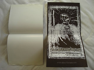
Finally, the inside of the sleeve. This is a no-brainer, since the original sleeve was blank on the inside. But the reissue has some fancy ass picture on the inside.

Plus, the reissue is on nice thick paper/card, whereas the original was on thin paper. So, all things considered, I have to say that the sleeve of the reissue is an improvement on the original.
Next, the record labels. Here's side 1 of the original:

And side 1 of the reissue:

This is where it starts to get interesting. The obvious difference is the removal of the 'One Life Crew' reference. This has just been replaced with the Integrity logo, and some small crosses. But there are a couple of more subtle changes. Firstly, that the song titles are in a larger font, and also they have moved further away from the centre of the record. Also, notice that the second song title now starts with a capital letter. And the original song titles seemed to be surrounded by black borders, as if the layout was done via cut & paste, but this effect does not appear on the reissue. Plus, the contrast has been turned down again so that the label looks pretty much just plain black.
It's pretty much the same deal on side 2. Here's the original:

And side 2 of the reissue:

Same deal as before. The 'One Life Drug Free' reference has gone, and the font has grown and moved a bit. Overall the new labels look more basic and less interesting.
Finally, the insert. I was originally going to do a post solely on the insert, but then decided to focus on the sleeve and record labels too. But for me, the more interesting differences are on the insert. So let's get on with it...
Here are the two inserts side by side, with the original on the left. First difference = the original is a little smaller. No idea why this would be. Did standard paper sizes change in the last 20 years or something?

Now, the photo. A modern classic. The original:

And the reissue:

What I like about the original is that it's got a blue tint to it. But that's not important. What's interesting is what's changed. There are three changes. Firstly, the dude on the right (as we look at it) is the vocalist. Everyone knows that the vocalist is Dwid, as the reissue shows. But how many people know he used to be known as 'John'? Also, everyone knows that the original drummer was Chubby Fresh, and the original photo confirms this. But if you look at the reissue, Chubby Fresh is no more. Instead, there's some dude called 'Tony'. And check out Tony's jacket. Pretty boring. I bet he wishes he had one with a big, fuck off X on it like Chubby Fresh used to rock.
Next, the bottom of the front page of the insert. The original includes a reference to '1990 One Life Productions' and a phone number for 'Tony' (which I am now assuming must have been the number for their drummer rather than the dude who ran their record label):

And, understandably, both of these things have been erased on the reissue:

Next, the flip side of the insert, which contains the lyrics. They look pretty similar from here I have to admit, but there are again a few subtle changes:

Change number one is an obvious one:

the removal of the band's contact address... which makes total sense. Here's the reissue:

Next, a funny one. The original featured a black square. Not sure why. It looks kinda weird.

But the reissue has fixed that by inserting a skull logo:

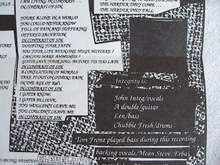
The band lineup also features the same name changes as the photo on the flipside. John has become Dwid, and Chubby Fresh has become Tony. But also, a more subtle change. The original says 'Integrity is' before the names, whereas the reissue has done away with the word 'is', since three of those dudes are no longer in the band. Also, look at the credits. The original credits backup vocals to Mean Steve and Erba. But nobody gets credits for backups on the reissue.
Also, as this next photo shows, the original had another 'One Life Crew' reference with the baseball bat logo:

But this has been cunningly erased on the reissue:

Funny though to see that the layout was done by Dwid. On both versions. So why on earth did he refer to himself as Dwid for the layouts but then call himself John in the photo that he did layouts for? Will we ever know? Probably not.
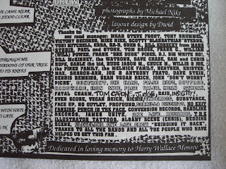
And finally, the thank you list on the original:

And on the reissue:

No wonder they got rid of this. Clearly there's no need to be thanking Victory Records (or fartknockers like Tom Capone!) in 2010.
Overall, I find it interesting that this thing was reissued in pretty much the same packaging, but with some subtle changes. Most reissues seem to use either the exact the same artwork, or something completely different. Not many have taken this approach of simply updating the original artwork. I find it kinda weird. A bit like re-writing history. But also slightly inconsistent. I mean, what's the point of removing the 'One Life Drug Free' references on the insert and record, but leaving the song 'Bringing It Back' on there, which contains with the lyric 'One Life Drug Free'? But still, the attention to detail is interesting from another perspective - because it means that these things aren't just being cranked out quickly to make a fast buck. Organized Crime Records are clearly taking a lot of time to do these reissues well, and that really comes out in their attention to detail. I guess they would be glad to know that all their hard work removing the word 'is' and changing lower case 'i's to capitals have been appreciated by someone :o)
Jesus Christ, I can't believe I just spent so much time on this crap. Possibly the most pointless and time consuming post I have ever done.

5 comments:
i wondered if you had the original on red. i needed that color so bad and in 1995 i was on tour with a band and we stopped by victory hq. thankfully, tony victory let me dig through the boxes in the basement until i found a red one. never played since i have the other colors too.
Now, this is what I call an AMAZING entry.
Cool story, Steven. I wonder if Victory still have boxes in their basement with anything half decent inside?
I have never heard this record, nor do I listen to Integrity...yet for some reason I read this entire post. Nice job.
Great post, I enjoy the attention to detail here. Also the white washing of the One Life Crew references is an amazing purge.
Post a Comment